Services and DELIVERABLES
- Social Media Feed, Banner and 11×17
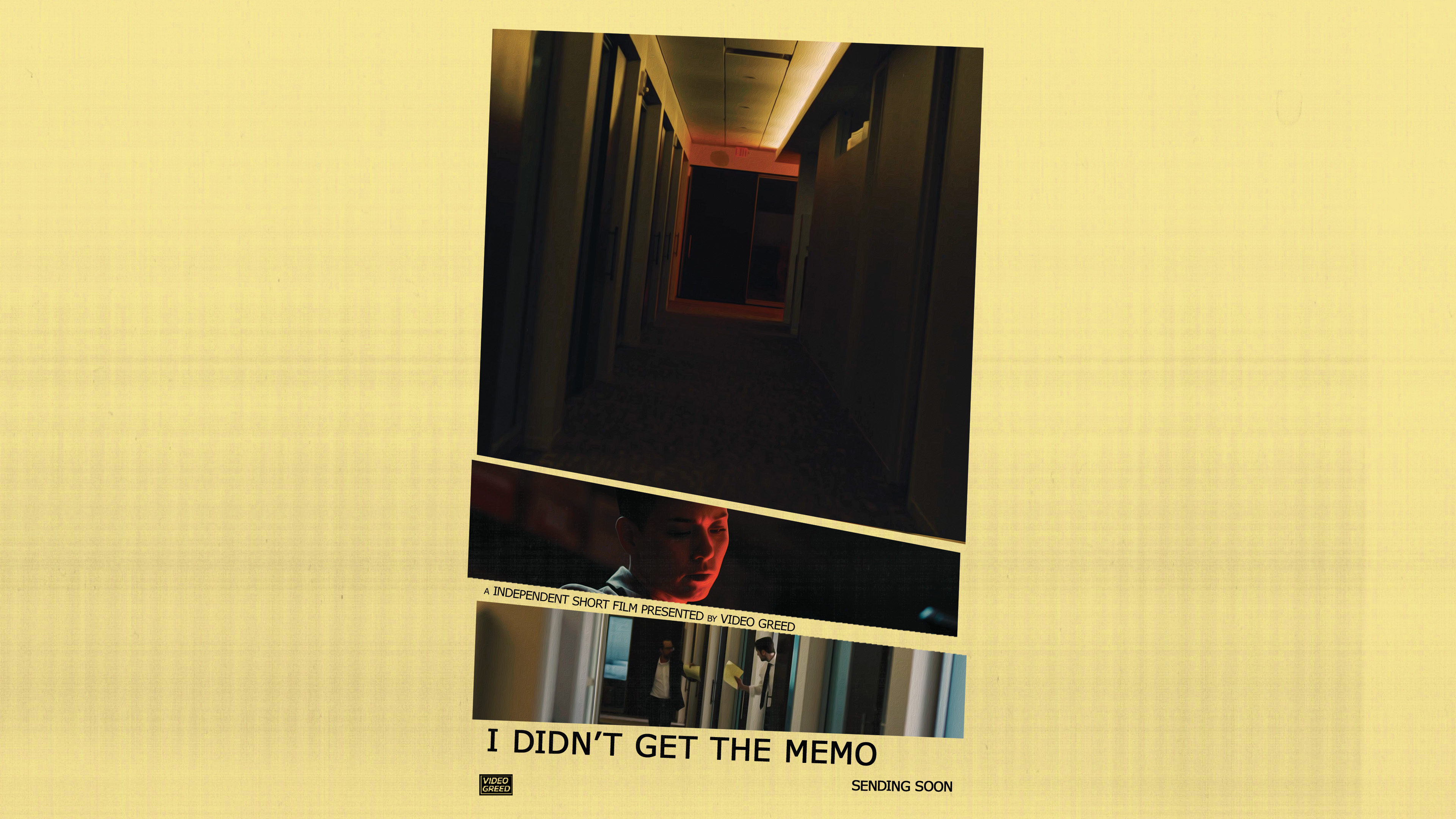
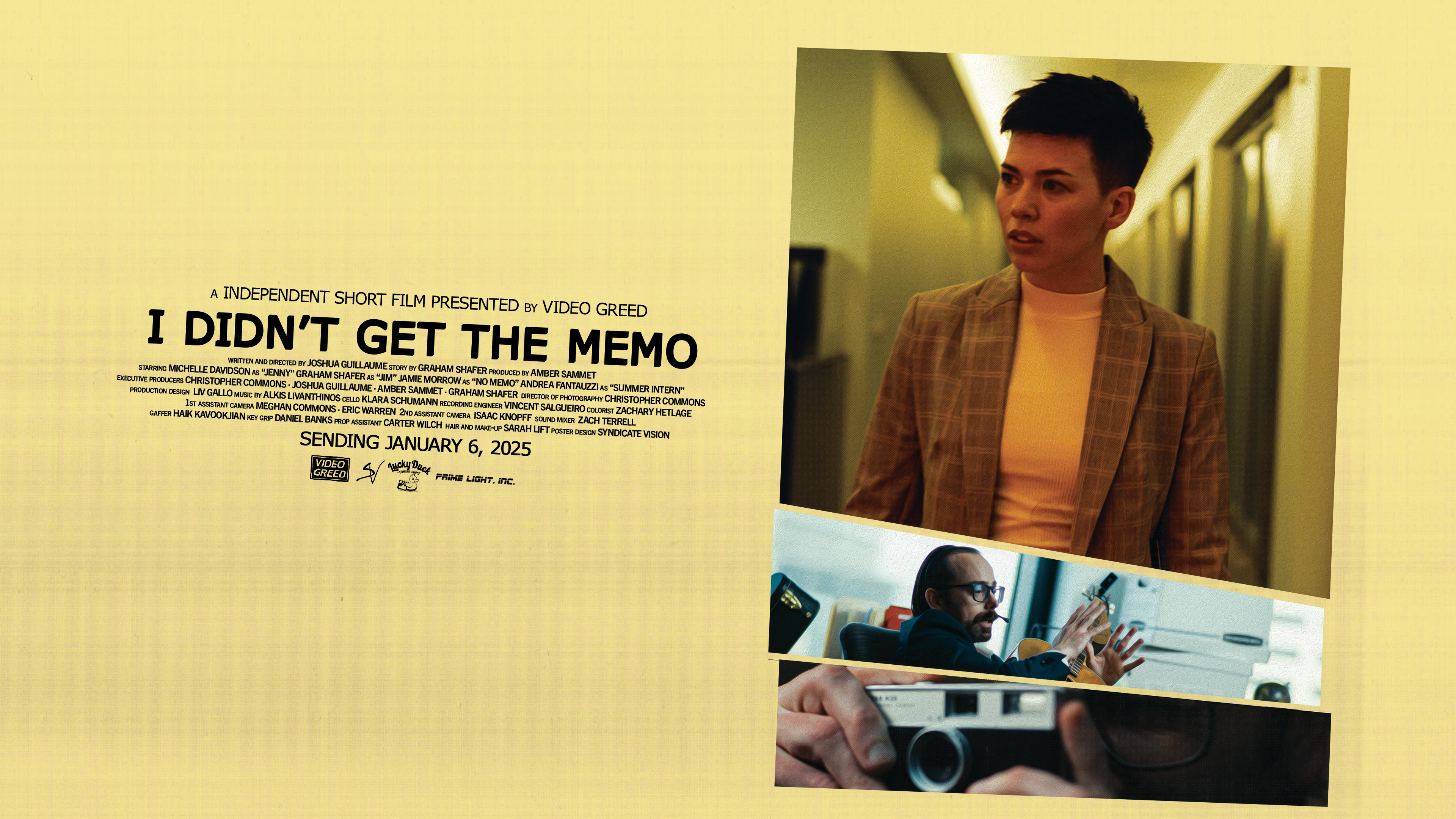
- Teaser, Coming Soon and Release Date
- Print File
Keep up with Video Greed
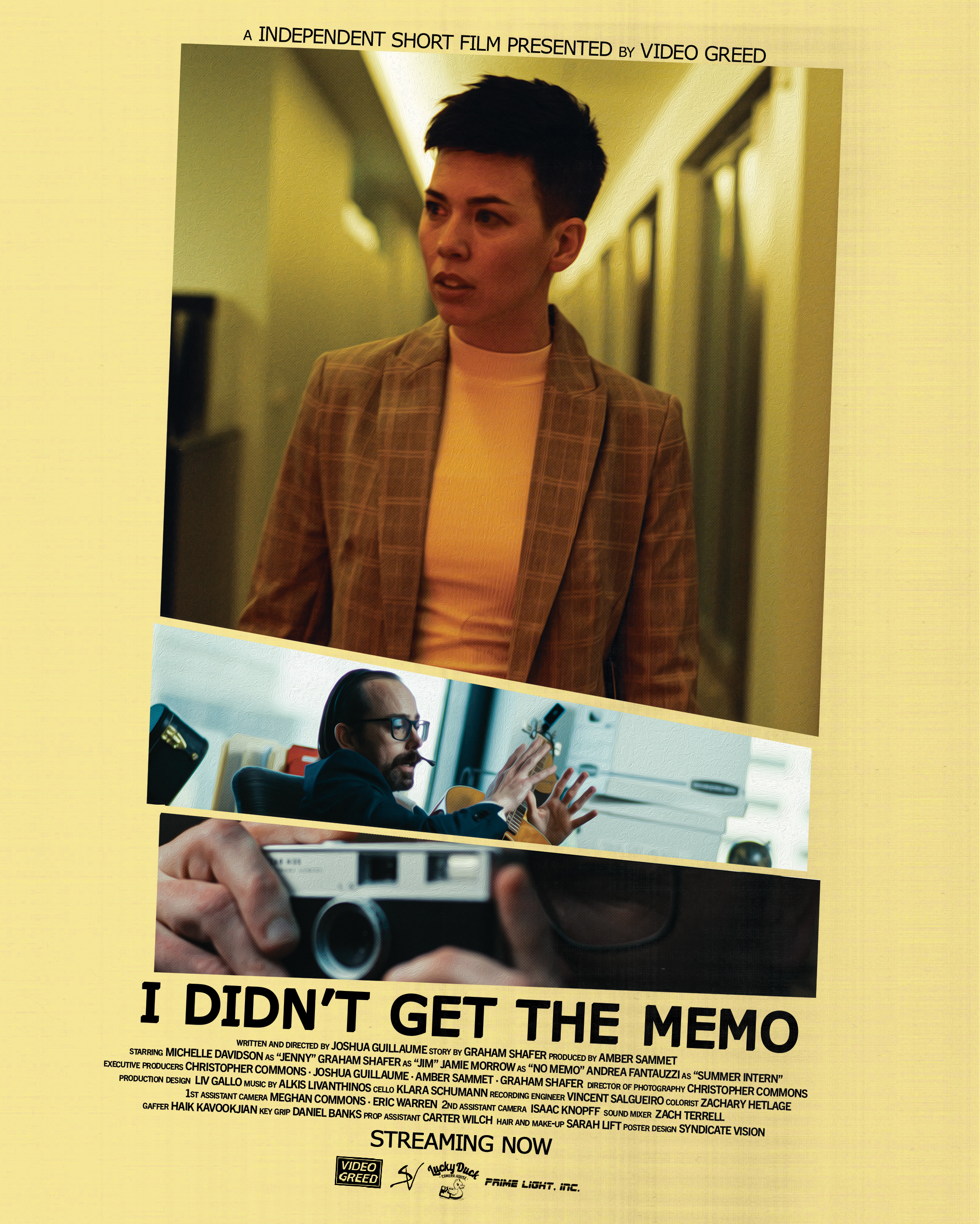
Synopsis: an absurd dark comedy about a new memo that brings together a strange office
Project type: Tribute
Design Breakdown
Inspiration: I wanted to create a poster that used elements found in a typical office with its colours and font(s). I explored a few ideas but in the end I’m pretty happy with how this one turned out and using screen shots from the film to tell its story, but not giving anything away so easily. Main idea behind this design is from a legal note pad and when prints give us a misalignment job.
I first tried to create a paper shredding effect, but didn’t get anything that worked out. So I went the direction of slanting the images as if the printer did a misalignment job that happens every once in a while.
Colour(s) and texture(s): With the film being based in an office. I thought what better staple we see… then the classic yellow legal note pad. tweaking the colouring to work with the poster and its CMYK profile. Overlayed a flawed printing texture to really bring out that misalignment effect.
Font: Verdana is another classic staple to the office corporate look. What drew me to use this font was its bold sans-serif look and the typewriter look while not being overly distracting